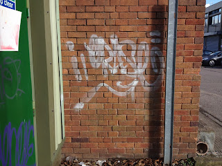
Graffiti
Its interesting that most of the grafitti I saw was written in capitol letters, with the use of traditional graffiti symbology such as signs and numbers to replace words.
Instructional information
Signs that were hand painted - cast in iron but painted over by hand. Use of Captiol letters fits the quick read required by passing pedestrians. Surprised to find that whole of information plaque at the cathedral wall to be written solely in capitol letters - for body text it is easier on the eye to read lower case. Hand painted signs still look smart and professional but have human touch and tangibility that make them more friendly/approachable and indicative of the area it represents - here worcester's period (Edwardian?) is complimented with the painted road sign.
Branding
Buildings next to the road bridge by the river severn. Although the paint has long been removed, the colour change of the bricks beneath leaves a negitive impression on the building's front: the text is still visible and partly readable and this reflects the initial desire and presence it had for some long during its name branding and then also now the visual absence of the paint in the building's reuse.
Paint and brick have merged and aged, telling the length of time this wall has been branded with the hotel of it's name. Note the interesting typeface tells in the letters "L" "S" and "G" where otherwise the letters appear to be of a simple capitol letter's even form.
Further along the branding is placed over a 3d brick extension to support the wall - when viewed square on, as would be seen from the river or opposite bank, it reads clearly, but closely standing at an angle it is clear the letter morphs into a new shape that isnt so clear to be a letter "E".
Hand Lettering to represnt the brand Aveda - the brand's logo and telling it is sold there. On looking up on the Aveda Website, the Hand lettering here is a representation of the typeface used by the brand, but has not been fully executed with acute care. The brand sells beauty products that a combination of nature and scientific merging, but only the nature side is told here, in the picture of the flower. It is a pretty eye catching board, but would benefit from a neater execution of the brand name in order to fully represent the brand.
Bold and traditional with its serif thick-stroke typeface in capitol letters. Made out of chalk on a chalk board gives it the human feel, extends the invitation out to be more inclusive even though it has been executed so neatly.
PepLow is carved and painted into stone on the high street floor. The monotone serif typeface represents a jewelers that are traditional and family run business, with a proud upstanding in the community. The website tells us it has been around since 1818, but also contains contemporary imagery and designs for modern fine jewlerry buyer. The craft of the name into the stone best communicates the quality of jeweler they sell.


